Trends: A Surface Design Blog
Simple. Product-obsessed. Quality first. From Match Graphics.
If it doesn’t make the room calmer, the hand happier, or the build more consistent, it’s noise.
This is our field guide to what matters now—and what doesn’t—for laminate surface design.
The Idea
Start with the room, not the press. Two meters away, under real light, next to hardware and paint—does the surface feel honest? If not, it’s out.
What Matters Now
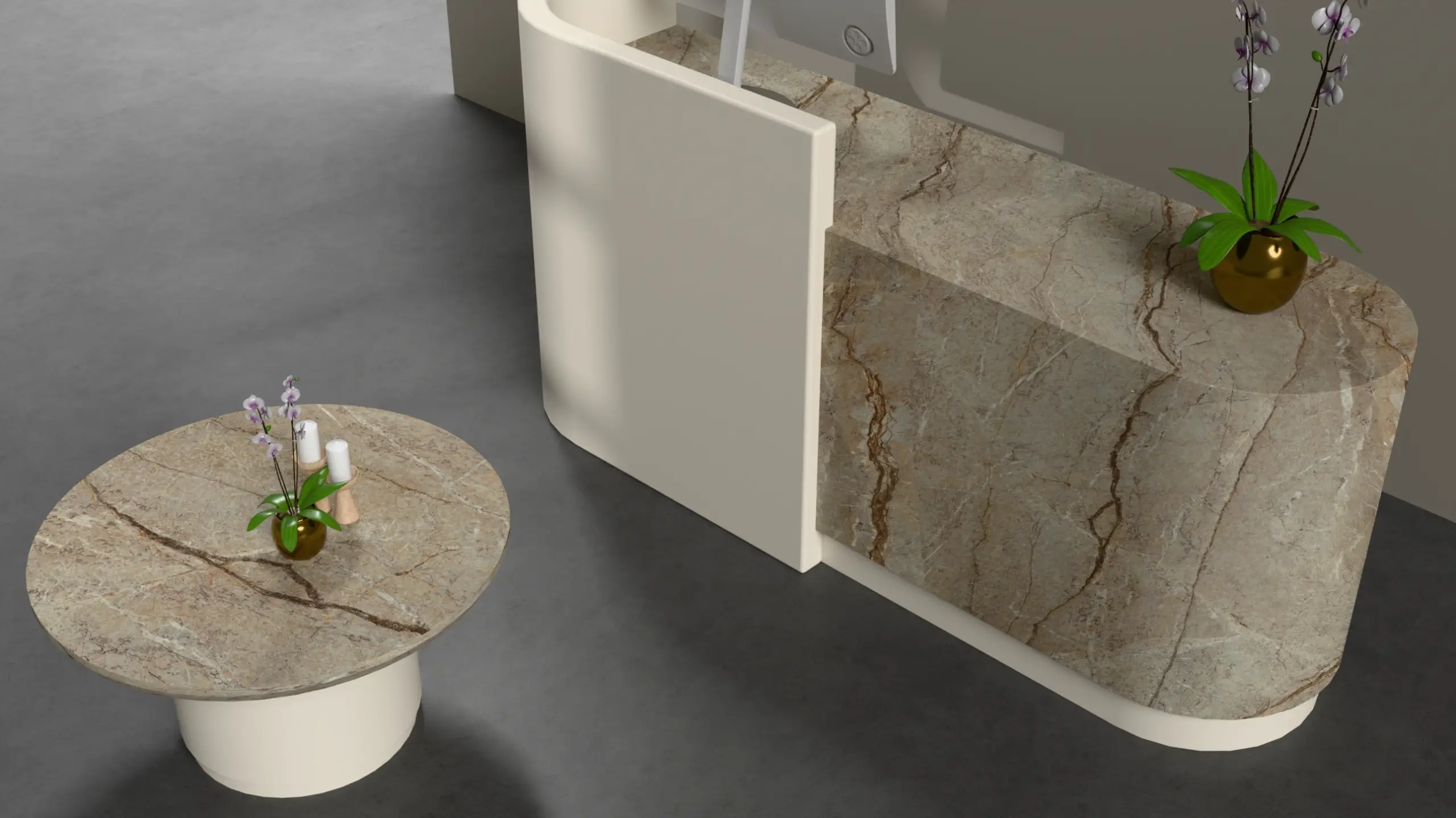
1) Warm, Quiet Color
Neutrals with a little life. They stay true at 7 a.m. and 7 p.m., under daylight and LEDs. Rooms feel calm; materials mix easily.
2) Real Scale
Grain and veining sized for wardrobes and kitchen runs. No poster-scale drama that looks counterfeit at home.
3) Touch-First Finishes
Ultra-matte that stays even. Soft to the hand, hard on fingerprints. Texture that invites use, not fear.
4) Calm Contrast
Depth without shouting: clean highlights, controlled midtones, shadows that don’t smear. The eye relaxes; spaces read larger.
5) System Palettes
Tones that coordinate across facades, carcasses, and accents. Fewer decisions for designers; fewer mistakes on site.
6) Apartment-Scale Elegance
Patterns built for compact rooms, with smart repeats.
7) Light Honesty
Looks right under more than one lamp. If a decor only works in a booth, it doesn’t ship.
8) Sustainability by Default
Lower-VOC pathways where compatible, longer-living aesthetics. Subtle signals, not slogans. The greenest surface is the one you don’t rip out next year.
What We’re Saying No To
- Dark tones that drain a room.
- Plastic-looking gloss on big planes.
- Hyper-contrast “demo pieces” that collapse at scale.
- One-light approvals.
- Trend churn disguised as innovation.
About Match Graphics
Decor papers printed in India. Image science + discipline, tuned for light, heat, and pace—so your chip and your site tell the same story.